Do you want to know what hours of the day a solar power system works? You don’t have to guess anymore. There is a website that will give you all the data regarding this information and much more with the new PV system output estimator.
A new website was launched by the Australian Photovoltaic Institute (APVI) that has plenty of “bells and whistles” for people who are interested in setting up their own solar systems. This website is funded by the Australian Renewable Energy Agency (ARENA). It offers a wealth of information about photovoltaic (PV) tracking.
The PV System Output Estimator
With the PV system output estimator, it will be easy for you to estimate your rooftop’s potential for solar PV before you install one. It is a free, 3D mapping program for customers thinking of installing rooftop solar systems in their homes. With these solar maps, you can determine your energy requirements and cost benefits of a PV system before you buy one.
This PV system output estimator was developed courtesy of a $436,000 funding from ARENA. It can account for solar radiation and weather at the location, tilt orientation, PV system area, and shading from nearby structures and vegetation.
This program is actually a part of a suite of updates to APVI’s Australian Solar Maps. The PV system Output Estimator can estimate PV output from selected rooftops, and the financial savings and emission reductions.
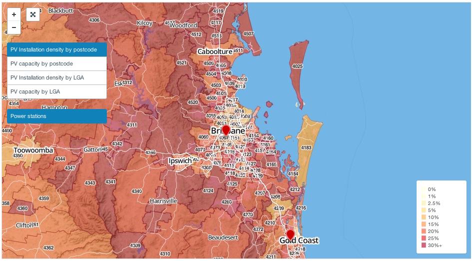
The map uses data from the Clean Energy Regulator from the ARENA. It offers a glimpse on how solar photovoltaic capacity and acceptance will perform on the local government and postcode levels.
Australian Solar Installation
Solar power systems tend to be a popular alternative because of the higher prices of electricity from the grid in many areas. For instance, Dubbo, New South Wales, remains one of the top postcodes in Australia for solar photovoltaics with almost 9 megawatts of installed capacity and nearly 30% penetration of roofs appropriate for solar power systems.
This situation seems to be a representative for regional areas across Australia. Just looking at the APVI’s solar maps will show this trend. It shows dark red and blue colours for high PV installation density and capacity respectively, in most of the non-urban areas in Australia.
The most useful of the APVI data tools is a live solar map with a state by state breakdown of the estimated PV output as a percentage of its maximum capacity in every state. This illustrates the specific hours of the day that your solar system collect the most sunlight.
There is also a feature in this PV system output estimator that enables you to animate the data, and follow it as the day rolls on. You will witness each state glowing red when they reach their maximum solar power potential.
This APVI PV system output estimator does not only give you up-to-date information of how your solar system is saving you money -you can also go back and review the data to see any day going as far back as the start of May this year. Data is given in a bar graph which gives you an indication of the spread of daylight hours, and enables you to compare data across the seasons.


